In the shadow of SpriteKit
All hail SpriteKit
When SpriteKit was introduced, it was love at first sight. For some reason it was easier to pick up than Cocos2D. And it felt more natural in Apple world.
It also gave me warm and fuzzy flashbacks to time when I was doing J2ME development on feature phones. J2ME had some native elements, but those were ugly and nobody really used these. Every app was done by drawing custom UI into canvas. Buttons, menus, texts.
On a basic level this is what also SpriteKit gives you. Components to create your own game UI.
Take one
In childhood I heard from somewhere about the logic game called Ten pair. There you need to strike out numbers adding to 10 (‘Ten’). Or matching ones (‘Pair’). It consumed countless hours and countless sheets of paper. Back then everything was analog. Over the years I forgot about it, but with release of SpriteKit I was searching for a project to play with. And simple logic game seemed easy enough.
Game logic itself was not that difficult, but something on UI level was bothering me. I could not find a satisfying way to manage the UI layout. Finally I ended up repositioning everything on screen bounds change events. Every screen element got the new size, positioned children inside it and asked them to do the same. It felt dirty.
I was playing around with an idea similar to springs and struts. In the end it got too complicated and I scrapped it. Manual layouts all the way!
I had a different idea that I wanted to experiment with, but I never got to it… Until now 🤓
Take two
When working on update for TenPair, I also wanted to re-work the underlying UI layout logic. Basic idea was to use something that works well out of the box and could handle screen rotations/changes. Could I tie game UI in SpriteKit to auto layout from UIKit? And if layout changes on system level, this will be communicated to sprite elements automatically.
After some playing around I arrived to a solution implemented in SpriteKitUI. On high level we have screens, views and buttons that are backed by native views. When a screen is loaded, it will use auto layout to position children. In the background we build an invisible shadow UI on UIKit level that will be tied to game UI elements. When ever there is UI layout change, game element will be updated accordingly.
As a rule, game element sizes and positions will never be defined in code. Only layout will be described and after native UI layer has finished, it will be propagated to game UI level.
Because we are using native shadow elements for views and buttons, we also get simplified user interaction handling out of it. For example, we can tie button actions to native button selectors, instead of implementing custom button detection. And because of layered native views, we can block interaction with background views. For example when menu is shown.
And all this can be used both on iOS and macOS.
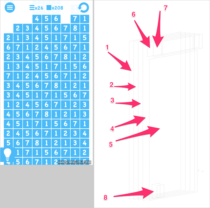
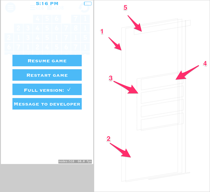
Following are two examples how game UI is seen, and what is done in UIKit/AppKit level.
Play screen contains scrolled view with play field and top menu bar.

- App view
- SKView
- Play screen backed by UIView/NSView
- Scroll view containing play field, backed by UIScrollView/NSScrollView
- Numbers field backed by UIView/NSView
- Top menu bar
- Menu button backed by UIButton/NSButton
- Hint button
On menu screen we contain presented options inside a stack view.

- Menu screen
- Scroll view
- Menu options container backed by UIStackView/NSStackView
- Menu options backed by UIButton/NSButton
- View containing clock and battery indicator
Conclusion
Overall this has been a good proof of concept for offloading UI layout management to UIKit level. Also user interaction got a lot simpler. At the moment it’s still tied to one game idea, but it feels like a solid foundation to continue from. Real test will be next game idea on tvOS?
Tags: ios, spritekit, uikit, appkit